After completing the finishing touches for my personal portfolio website I took away even more that I have learned than with my previous website, and it is also a website I take more pride in making. Of course that means it was not without its difficulties in both the design and implementation phases.
Design
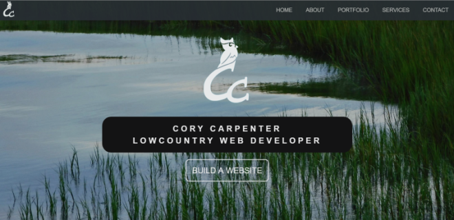
As I mentioned in my previous post, I had wanted to make a portfolio website for quite some time, and had many different ideas I wanted to try. I will admit I was over ambitious with how I wanted to display my content and brand. Furthermore, I was looking around at other popular web design portfolios which all had unique and complicated CSS and JavaScript interactions in their site. They were works of art in the form of a website. So I wanted to jump ahead of myself to make something equally enticing. I chose to brand my website on my love for nature and forests.
My first design complication was in the landing page where I wanted the menu to be signs hanging from a large tree in the center. I quickly learned that making it responsive would be a huge challenge, and I could not get the links to stay perfectly on top the same spot of a shrinking background image. I wanted an owl to swoop down placing each link, finally perching on a tree to the side. I planned for vines going down the sides of the website with the actual portfolio being a custom slideshow displaying each website I’ve worked on. As with all designs after the prototype user test I decided a slideshow is neat to look at, but bad for displaying multiple projects that the view may want to quickly glance at for something of interest. It was changed to each project being a leaf on a vine going down the center of a page.
After many renditions, including a space ship featuring each project as a planet, and another forest with fantasy portals to the projects, I was getting an overall sense of fascinating idea, but impractical and a sense of potentially being tacky in practice. I wanted something more professional to display my skills, potentially even a site that would inspire future clients to want something of similar nature. I was also thinking about how great of an area Charleston is in terms of business and hospitality, and so I was inspired to carry that on through my website — a local and professional website that was still friendly.
Implementation
The simple
While I was finishing up my design for the website I was learning about how to implement a parallax effect where a websites content will scroll over an image revealing and covering parts of the image. More websites have been using parallax, and it does look impressive on a site. I wanted to use the parallax with header text overlaying them to title each section of the website. I was surprised at how simple it was to achieve the effect with just a couple divs and a span in html, and some CSS making the background an image and using background-attachment: fixed rather than background-attachment: scroll to achieve the desired effect. Sadly, I discovered the effect does not work the same on all mobile devices since the device saves battery by not loading the page until the finger scrolling is completed. So the effect would appear studery rather than impressive.
I also noticed the overall time it took for me to implemented the design into an acceptable website was much shorter than before. My favorite way to work through website development is to write all the html content before hand, then go back and make it all start to look nice through the CSS.
The challenge
Surprisingly, or perhaps unsurprisingly most of my struggles involved making the website fully responsive. I found myself struggling most with making the navigation bar working correctly when making it responsive. I had made the navigation bar for desktop computers using a different method than my previous website, so using the same CSS to make it appear correctly on mobile was not working correctly. In the end I decided to recreate the navbar from the ground up in mobile first, and tested it frequently until it was working in all formats.
The other issue that stumped me was wondering why the content in my landing page did not extend the section it was in when shrunk to lower sizes, or when flipped to landscape mode on mobile. The obvious answer was the background I was using was measured with 100vh so the image would always take up 100% of the available height no matter the screen. However, this also means the content in that section must always fit on that screen size. The best solution to this issue was to use media queries to alter the image, header, and button displayed on the landing screen to fit smaller screen sizes. As a result I must admit I used !important on the adjustment for landscape phones as it was competing with width and height specifications. I’ve heard it is bad practice to use, but I felt it was introduced to the language for circumstances like this.
A final note on media queries: one of the issues that I may be creating for myself is trying to keep track of what is changed in which particular media query. To create the best looking content on all screen sizes minor adjustments to image size, padding and margin, font sizes, etc are made when the content indicates it needs changed. I’ve found myself getting lost as to what I changed where once more and more media queries are added, and I have to change something I’ve changed 2 to 3 times before. I currently working on figuring out if this is simply a documentation error on my part, or incorrectly using media queries, and I need to make the content in such a way that those adjustments do not need to be made as frequently.


 Cory Carpenter's Coding Excursions